03: Game of Thrones Visualization#
This week we’ll continue to practice with the two types of network visualization: static and dynamic. You’ll continue to work with the Game of Thrones dataset that we’ve been using to practice.
In a short Jupyter notebook report, answer the following questions about this network. Don’t simply calculate the answers: make sure you’re fully explaining (in writing) the metrics and visualizations that you generate. Consider the Criteria for Good Reports as a guide. You can create markdown cells with section headers to separate the different sections of the report. Rather than number the report as if you’re answering distinct questions, use the questions as a guide to do some data storytelling, i.e. explain this network’s data in an organized way.
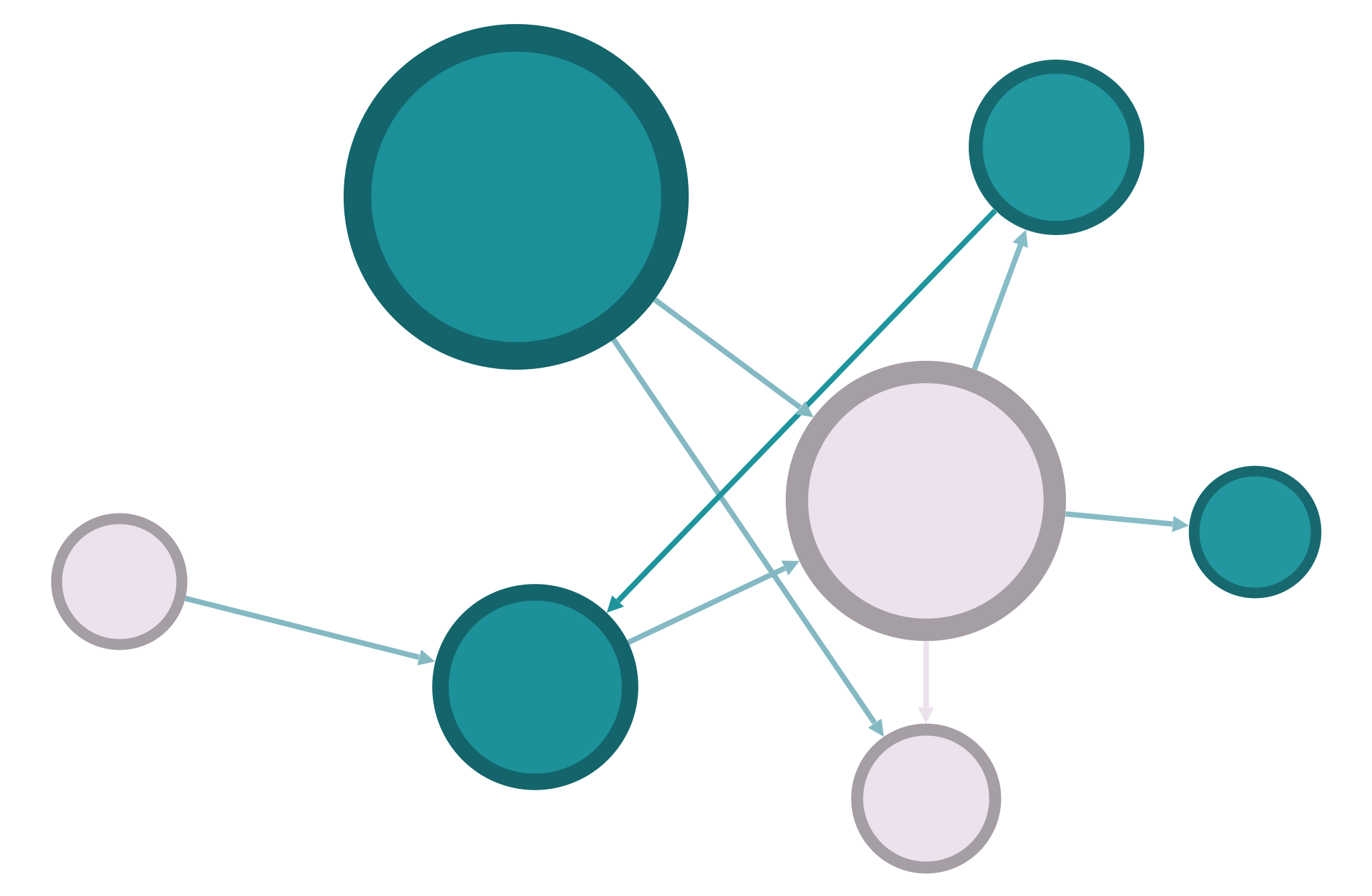
Finish polishing your Gephi visualization of the GoT network. This is a static visualization, so think about what things can be shown visually with this kind of graph. Your visualization must include: a use of node color to show a calculated metric, a use of node size to do the same (but it can be a different metric), some visual expression of edge weights, readable node labels, a clear intentional layout, and written captions and key (these should probably be added to the image after you export from Gephi).
Create a dynamic visualization of the GoT network with
nx_altair. This should be visually distinct from your Gephi visualization and use different attributes. Think about how this kind of visualization might allow you to show something different about the network. Your visualization must include: tooltips and scrollable zoom; an additional plot that shows another feature of your network as a bar plot, scatterplot, or histogram; use of node size and color; use of onedraw_networkxparameter or attribute that is not mentioned in our textbook; and a clear intentional layout.Both of your visualizations should be included in this Jupyter notebook. (We will discuss how to add an image to a notebook in class.) The notebook should include explanations of both of the visualizations and the choices you made, and you should turn in this notebook and your static visualization image.
Your visualizations should not be identical to anyone else’s! Though you may get advice from others, you should work to make your visualization unique.
n.b. To answer these questions, you’ll need to use a mixture of the NetworkX skills we’ve been working on, as well as combine NetworkX code with pandas and altair.
When you’re finished, remove these instructions from the top of the file, leaving only your own writing and code. Export the notebook as an HTML file, check to make sure everything is formatted correctly, and submit your HTML file to Sakai.
