Visualizing Data

DA 101, Dr. Ladd

Week 4

xkcd.com/688

Some Good Resources on Visualization

Why Do We Visualize Data?

Visualization can be exploratory, explanatory, or both!

Exploratory viz helps us (the researchers or analysts) understand the data.

Explanatory viz helps others (the clients or audience) understand our analysis.

Many visualizations do both of these things at once!

What Does Visualization Help Us to See?

Viz Can Help Us See Amounts.

Graph a single value across one set of categories.
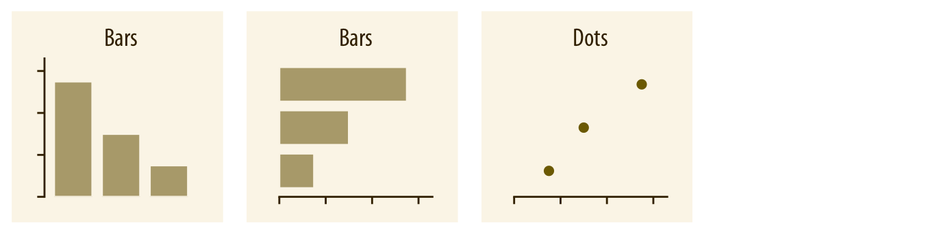
  • Variable types: 1 categorical and 1 numerical
  • Common graph types: Bar plot (Don’t confuse the dot plot with the scatter plot!)

Plot Amounts With Multiple Categories.

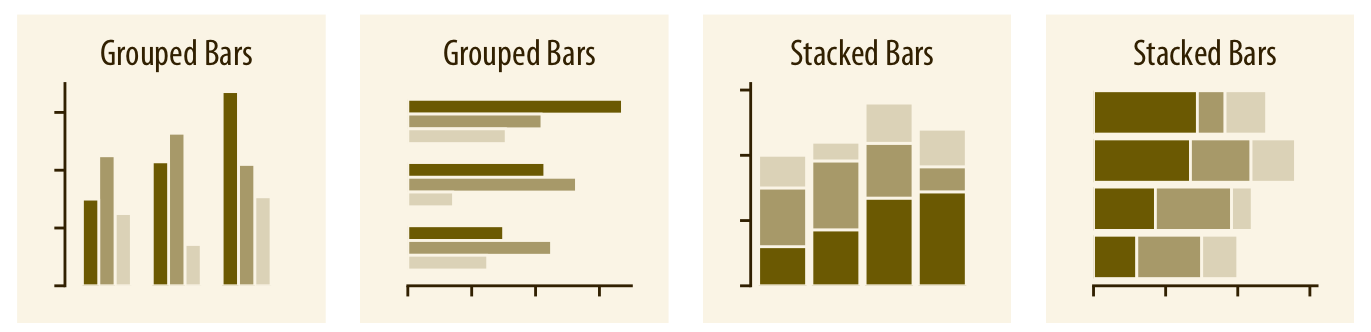
  • Variable types: 2 or more categorical, 1 numerical
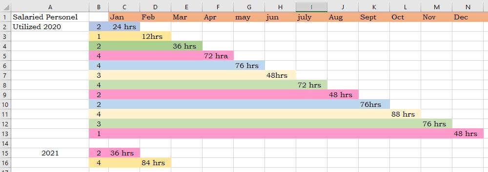
  • Common graph types: Grouped or stacked bar, heat map

Viz Can Help Us See Distributions.

Graph a distribution of a single variable.
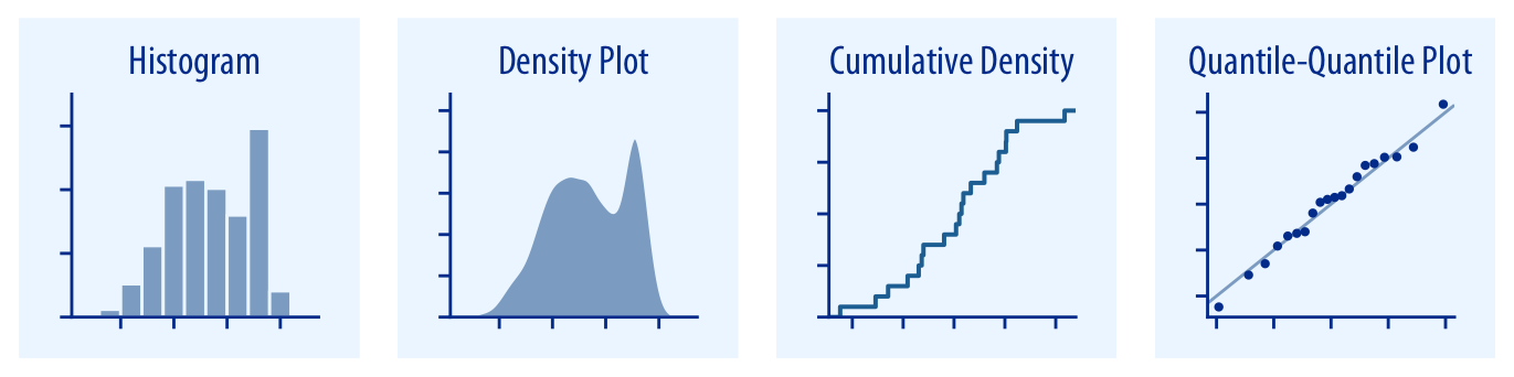
  • Variable type: 1 continuous (numerical)
  • Common graph types: Histograms, Density plots, Q-Q plots

Distributions with Multiple Categories.

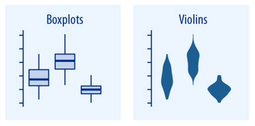
  • Variable types: 1 continuous (numerical), 1 categorical
  • Common graph types: Box plots, Violin plots

You Try It!

Look at the documentation for the mpg data set. What visualization type would you use to compare the counts of each type of car? Which variables would you use, and what kind of variables are they? Jot down your answers.

Viz Can Help Us See Proportions.

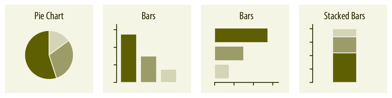
  • Variable types: 1 numerical, 1 categorical
  • Common graph types: Pie chart, Bar plot

Viz Can Help Us See Relationships.

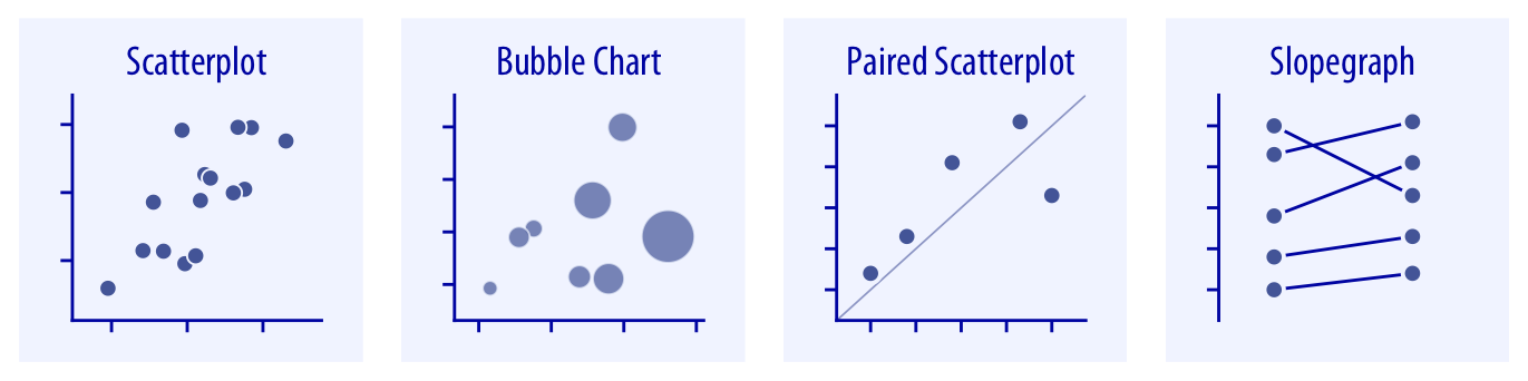
  • Variable types: 2 continuous (numerical), (3 in a bubble chart)
  • Common graph types: Scatter plot, Bubble Chart, Hex bins, Density contours

You Try It!

Look at the mpg documentation again. What visualization type would you use to compare the distribution of city fuel efficiency among different drive trains? Which variables would you use, and what kind of variables are they? Jot down your answers.

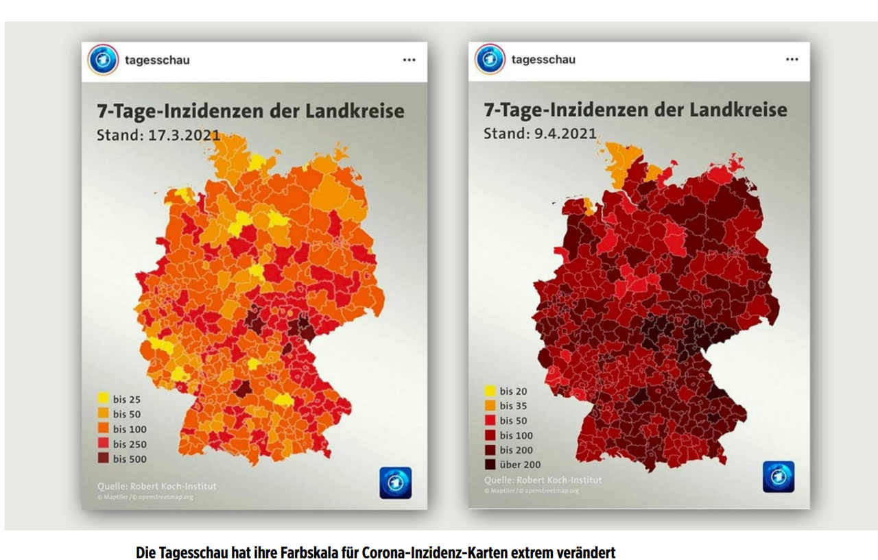
Viz Helps Us See Time, Location, Uncertainty

Confidence bands are an example of visualized uncertainty.

More on these viz types in future lessons!

Make Great Viz with ggplot2

Import on its own or with tidyverse

library(ggplot2)

or

library(tidyverse)

The ggplot() function takes two arguments, data and a mapping

ggplot(data = YourDataFrame, mapping = aes(x = FirstVariable, y = SecondVariable))

You can use this with or without the argument names data = and mapping =.

Aesthetic mapping defines what variables should be used.

ggplot(data = YourDataFrame, mapping = aes(x = FirstVariable, y = SecondVariable, color = ThirdVariable))

In this example, FirstVariable becomes the x-axis and SecondVariable becomes the y-axis. You can also add a mapping for color.

Add different layers to your viz with the + sign.

ggplot(data = YourDataFrame, mapping = aes(x = FirstVariable, y = SecondVariable)) +
    geom_point() +
    geom_smooth() +
    facet_wrap(~ThirdVariable)

The + works sort of like the %>% in dplyr.

Create different shapes and plot types with geom layers.

  • geom_point()
  • geom_bar()
  • geom_boxplot()
  • geom_histogram()
  • and on and on!

You can put aesthetic mappings inside geom layers if you prefer!

You Try It!

Create a plot to compare the price of a diamond to its weight using ggplot’s built-in diamonds dataset. Then create the same plot but show color as the quality of the cut.

Group your data by category with facet layers.

facet_wrap(~x): Use a single categorical variable.

facet_grid(x ~ y): Use two categorical variables.

ggplot(YourDataFrame, aes(x = FirstVariable, y = SecondVariable)) +
    geom_point() +
    facet_wrap(~ThirdVariable)

Statistically transform your data with stat layers.

  • stat_count() counts up categories and works behind the scenes in geom_bar().
  • stat_bin() creates countable segments of continuous data and works behind the scenes in geom_histogram().
  • stat_summary() lets you summarize any aspect of your data.

Use ? to get more information about any ggplot layer.

?facet_wrap
?geom_histogram
?stat_bin

You Try It!

Create a plot showing the distribution of weight in the diamonds dataset. Then show the distributions according to each color of diamond. Finally, change the size of the bins in each distribution to show more detail.

Ugly, Bad, or Wrong

More Examples of Bad Viz

viz.wtf

r/dataisugly