Predictive Analytics: Multiple Regression
DA 101, Dr. Ladd
Week 11
Multiple or Multivariate Regression
Multiple Regression lets you add more independent variables.
Bivariate regression (the normal kind):
\(Y=b_{0}+b_{1}x\)
Multivariate regression:
\(Y=b_{0}+b_{1}x_{1}+b_{2}x_{2}+b_{3}x_{3}+...\)
You can add more variables to the fit() function.
Let’s use the mtcars dataset, which has more variables than mpg.
Once you have a model, you can predict new values!
How to Choose Predictor Variables
There’s no magic solution! You can try different options, but use your logic and don’t just throw everything in there.
Occam’s Razor says that the simplest model is probably the best one.

As you add variables, \(R^{2}\) will increase.
But think about how much it’s increasing.
And use Adjusted \(R^{2}\) for multivariate models. It accounts for adding more variables.
Avoid Multicollinearity: when two predictor variables correlate.
This will confuse the model and mess up your results! It could even result in false predictions.
How do we find multicollinearity?
You can do a pairwise comparison of the variables you’re thinking about.
This will give you scatterplots and correlation coefficients to compare.
You can consider categorical variables as predictors, too.
But in the coefficients, the first category will always be left out as the baseline.
All the remaining slopes are relative to that baseline!
Let’s create an example using the mpg dataset.
Challenge: Seattle Housing Data
Try to make an effective multivariate linear model to predict housing prices in Seattle.
Take a look at the dataset and logically choose some predictors. Check for multicollinearity before you run your model! When you’re done, try to predict housing price based on some new data points you create.
Download house_sales.tsv. You’ll need to open this with housing <- read_tsv("house_sales.tsv").
Regression Diagnostics
Like the Q-Q Plot, diagnostic plots help us understand if our model is valid and reliable.
autoplot() gives us four common diagnostic plots.
Without ggfortify, you will see an error: “Objects of type lm not supported by autoplot.”
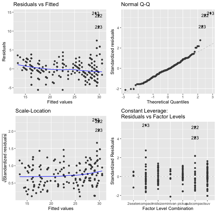
On all of these graphs, pay attention to labeled/numbered outliers.
Top right shows the Q-Q Plot.
We know this one already! Look for the dots to be on the line.
Top left shows Residuals vs. Fitted Values.
Residuals (the vertical distance from a point to the regression line) versus the fitted values (the y-value on the line corresponding to each x-value).
The blue line should be relatively flat and lie close to the gray dashed line.
Bottom left shows the square root of standardized residuals vs. fitted values.
The x-axis is the same here as on the one above. This graph helps us see homoscedasticity, that the variance in the residuals doesn’t change as a function of x.
We want the blue line to be mostly flat. We want to avoid heteroscedasticity!
Lower right shows standardized residuals against leverage.
Leverage is a measure of how much each data point influences the regression. On this plot, you want to see that the blue line stays close to the horizontal gray dashed line and that no points have a large Cook’s distance (i.e, >0.5).
In this case, it’s showing factor levels because we used a categorical variable.